Key Findings

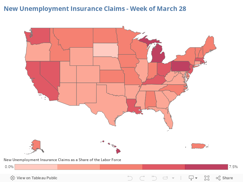
Map 1 below shows the relative level of initial unemployment claims for the week ending March 28 as a share of the labor force (as of February). The recession that the country is undoubtedly in right now has hit different states at different times, and states’ unemployment insurance systems differ in eligibility requirements and how complicated it is to file. This map reflects which states were hit the worst in the week ending March 28, the most recent time period for which these data are available, and how many of those losing their jobs were able to file under the state’s laws.1
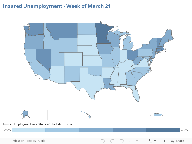
Map 2 shows “insured unemployment”—that is, those who are unemployed and actually receiving unemployment benefits—as a share of the February labor force for the week ending March 21. This measure, from a week earlier, shows all of those who were receiving benefits, not those who filed an initial claim in the week.
For more information, visit the Department of Labor website.
1. For recipiency rates, the share of the unemployed who receive benefits, by state, see Table 2 of the Appendix of “Some States Much Better Prepared Than Others for Recession” by Michael Leachman and Jennifer Sullivan, Center on Budget and Policy Priorities, March 20, 2020.

Michael Ettlinger is the founding director of the Carsey School of Public Policy.

Jordan Hensley is a policy analyst at the Carsey School of Public Policy.