COVID-19 has created havoc with the economy nationally, and New Hampshire has certainly not been spared. The charts and tables below tell the story. Note that all jobs data presented are seasonally adjusted. This means that normal job changes due to seasonal shifts are accounted for by the Bureau of Labor Statistics.
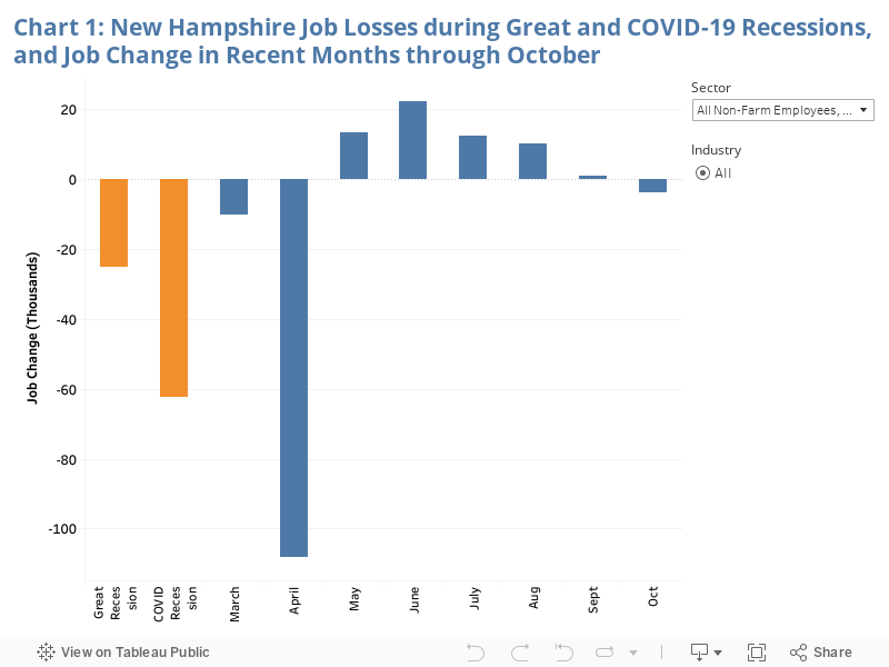
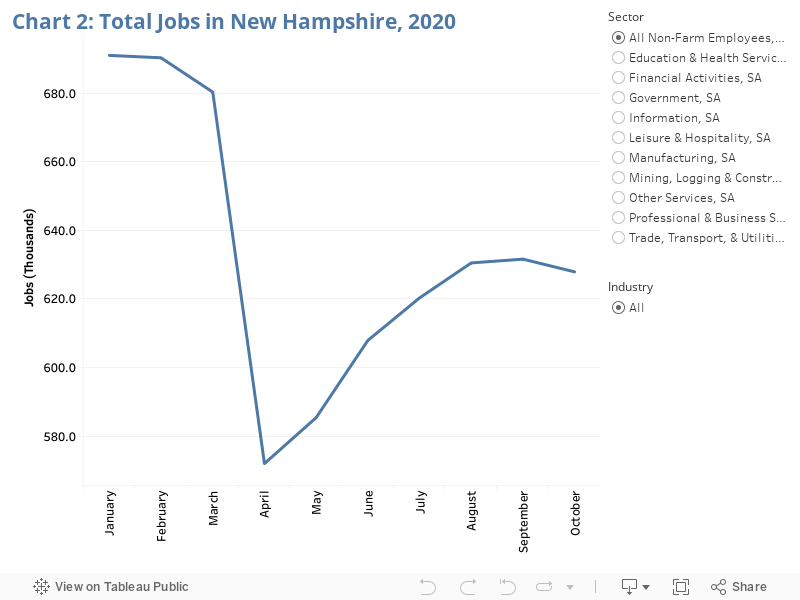
Chart 1 compares the job loss during the Great Recession with the net job loss to-date of the current crisis. It also shows monthly job change since February. In the Great Recession, the state was down 3.8% of its jobs at its low point—25,000 down from the peak. As of October, the state is down 9.0% of its jobs from February—totaling over 60,000. The big drop off occurred primarily in April, with modest recovery peaking in June and then tailing off in subsequent months. This follows the pattern that has been seen nationally. October saw New Hampshire again losing jobs. The sharpness of the initial drop and the limits and declining pace of the recovery can also be seen in Chart 2. Individual sectors and industries can be selected in Charts 1 and 2 to see their employment patterns.
The declining pace of economic recovery can be attributed to continuing barriers presented by the failure to contain COVID-19 and declining federal government support.
Source: Bureau of Labor Statistics
Chart 3 shows which industries have contributed most to the job loss. Not surprisingly consumer facing in-person industries have taken the hardest hit.
Source: Bureau of Labor Statistics
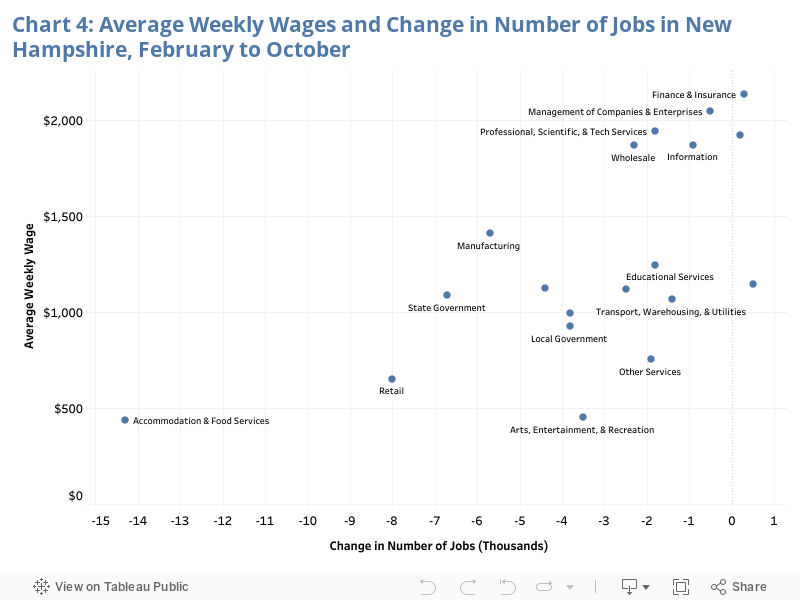
Chart 4 shows the job loss by industry plotted against average weekly wages in 2019. Overall, the largest job losses have disproportionately occurred in industries with lower wages—putting the greatest strain on the households least able to afford disruptions in income.
Source: Bureau of Labor Statistics
Chart 5 shows the unemployment rate since 2007. After a long decline following the Great Recession, New Hampshire’s unemployment rate leveled off until it spiked in April before declining throughout the rest of this year. It is a somewhat flawed measure at this time because those who are not actively seeking employment are not counted as “unemployed.” Under current circumstances an unusual number of people who would otherwise be seeking employment are not, because of public health conditions. Map 1 shows the unemployment rate by county. Scrolling over a county reveals the rates for each month since May for that county.
Source: Bureau of Labor Statistics
Source: Bureau of Labor Statistics
Chart 6 shows the employment-to-population ratio since January. This is the percent of the population that is working. The chart shows how it declined dramatically in April and how the recovery has been very gradual—completely stalling in recent months. In the long run this measure is influenced by demographic factors—especially the age profile of the population. For this short period of time, however, it is very illustrative of what is happening in the state’s labor market.
Source: Bureau of Labor Statistics